The Politics of a Presidential Campaign Logo
That loud noise you hear in the background is the collective whining of many critics carping about her campaign logo.
Apr 14, 2015
On Sunday, Apr 12, Hillary Clinton announced her highly anticipated run for the presidency. Along with the announcement came unveiling a campaign logo — and a surprising amount of design criticism.
That loud noise you hear in the background is the collective whining of many critics carping about her campaign logo.
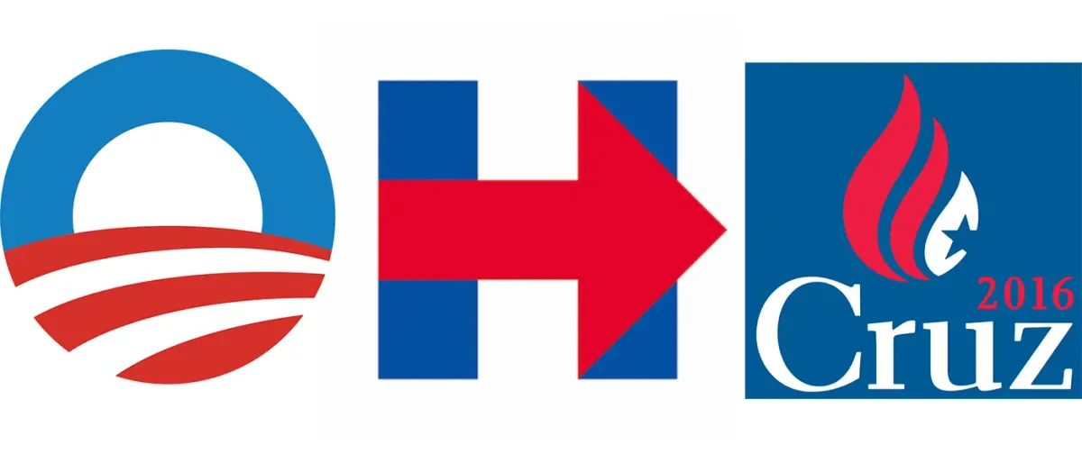
Since Sunday, the design community has been hurling those ultimate insults to professionalism — “It looks like it was designed with MS Paint,” and “Did she hire someone on Fiver?” at the logo. At the same time, the politicos have decided that the direction of the arrow in the design represents a move to the right for the centrist candidate.
To be fair to all those critics, it’s far from a brilliant logo, but I’m not sure it needs to be. The next occupant of 1600 Pennsylvania Avenue will be succeeding a president whose campaign logo was probably the most iconic in history.
I don’t think Hillary Clinton’s campaign wanted to compete with President Obama’s logo. What’s more, the design constraints of a presidential campaign logo are pretty significant. It has to use red, white, and blue, or it will be perceived as unpatriotic; most have either stars or stripes, although the Obama logo didn’t, and that’s one of the reasons it was so innovative. Clinton’s logo forsakes both stars and stripes for the much-criticized arrow.
Republican candidate Ted Cruz has a logo that has been compared to a burning American flag. On top of that, the Cruz campaign had major domain name issues when it launched several weeks ago. However, as the presumed front-runner, Clinton is getting almost as much press for her logo as she is for the early stages of her campaign.
When I look at the logo on Clinton’s campaign website, I see it being used more as a mark and less as a logo (although it is, of course, a logo). It’s not the most prominent thing on her home page. As Mark Wilson of Fast Co. Design pointed out recently, the logo does tie in with the site’s overall design language, which includes arrows pointing to prominent calls to action, such as signing up and donating. That seems like an intelligent strategy.
Another innovative aspect of her logo is that it is essentially a square format, which will serve the campaign well in its use of social media — something that no political campaign can ignore.
And besides, the candidate’s logo has already inspired a new typeface — Hillvetica.
The 3 points outlined in this excellent analysis indicate that time — and constant exposure — will tell whether or not the logo effectively communicates the candidate’s larger brand strategy. Maybe the campaign is leaving that open to interpretation on purpose.